Lost Ark Forums Redesign.
Product: Conceptual Mobile UI Redesign
Duration: 2 Weeks
Role: UX Designer
Background
Why did I think this website needed a redesign in the first place? In the beginning this project was not something I would have ever considered. However my passion for this game lit a fire under me and motivated me to chase after this idea. Lost Ark is a game that was developed by an Eastern game studio Smile Gate and published by Amazon Games in the west. It’s concurrent users number over a 1 million and the number of concurrent forum users number at least 100 thousand.
Problem
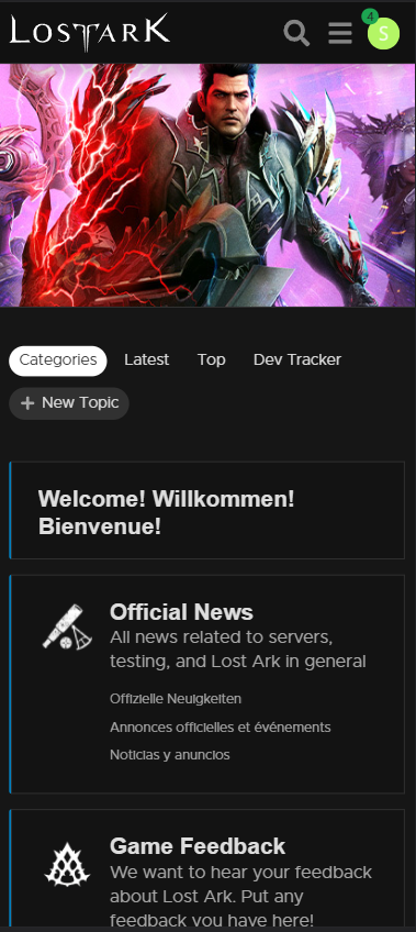
Lost Ark is a PC game so naturally the forum experience would be optimized for the Desktop view as well. When looking at the current mobile view of the forums I can confidently say that it was lacking in a few areas. In order to do this product and experience justice I had to take it apart from the bottom up. I decided to focus on the mobile UI as I had felt that the mobile experience had been neglected due to the nature of the platform.
Goals:
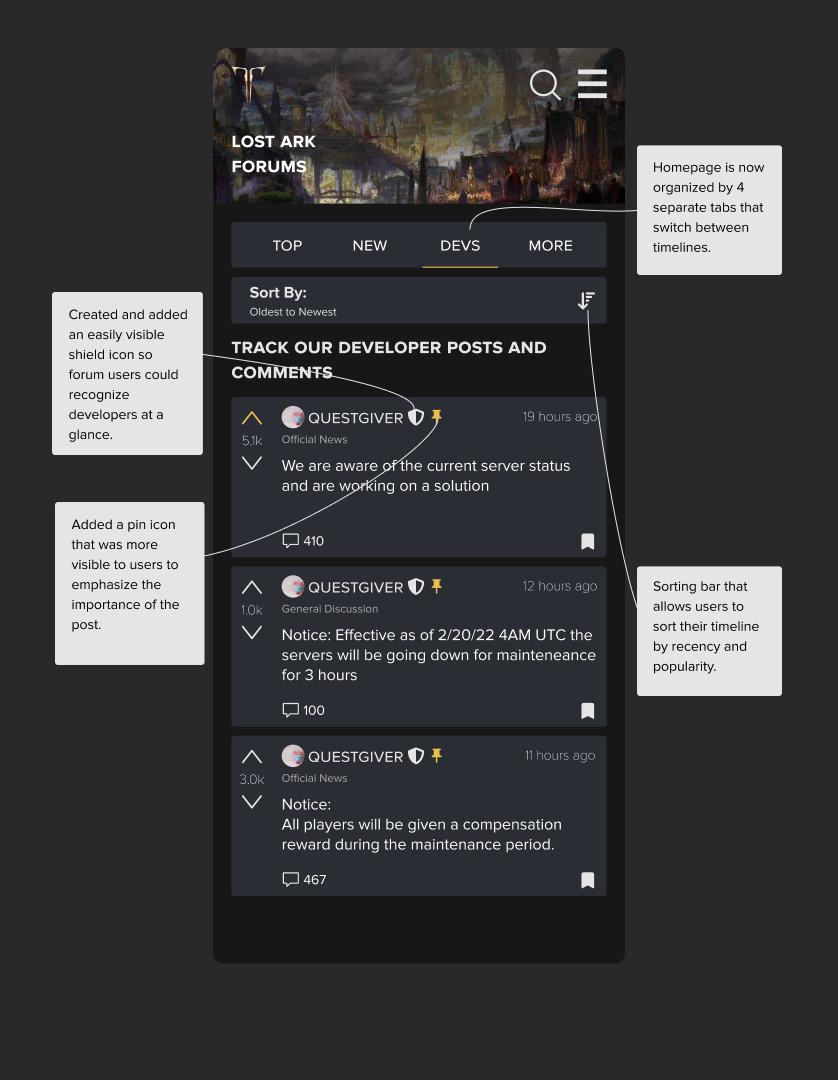
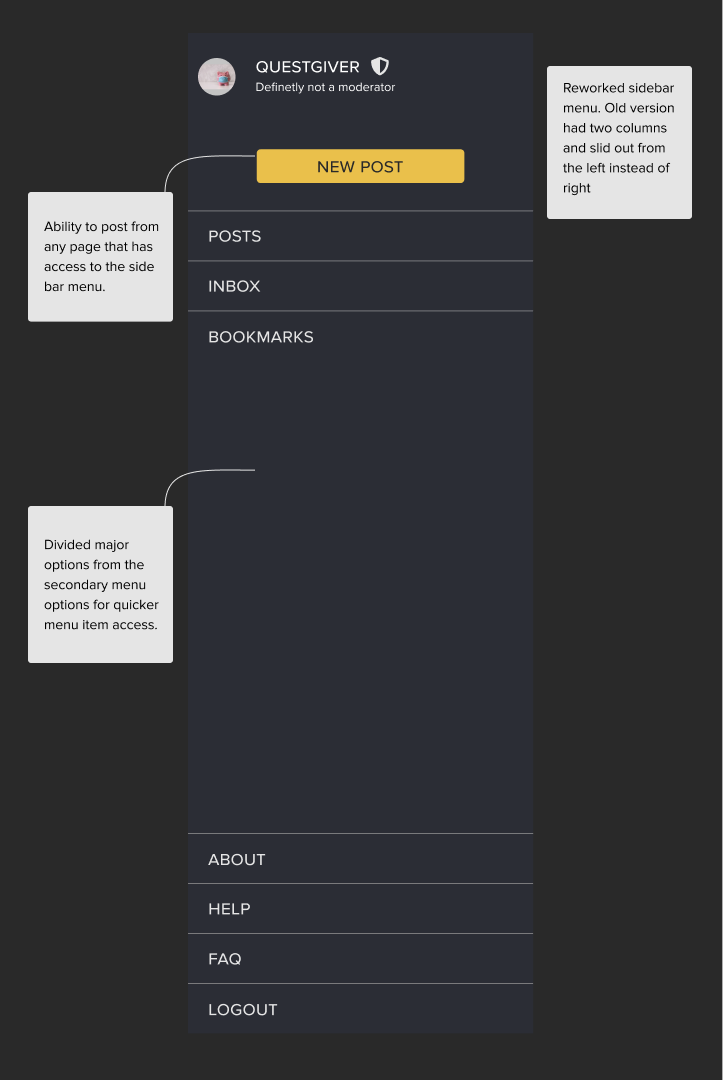
Improve visual hierarchy on the mobile website
Organize the information to be more readable and user friendly
Create a more memorable and optimized user experience
UI Highlights
Research
Heuristic Analysis | Personas | Competitive Analysis
Heuristic Analysis
There were 3 Main criteria that I analyzed:
Visibility / Readability
Information Layout
Navigation
Here were some of the main takeaways from each criteria:
Visibility / Readability
Color Contrast and accessibility issues
Imagery and iconography
Information Clutter
Information Layout
Information overload
Unneeded information is also displayed
Language Overlap and repeated information
Navigation
Inconsistent navigation behavior
Embedded navigation elements within other navigation elements
Search is not design for users but for developers
Personas
-

The Developers
They have designed both the game and the forums. Usually visiting the forums to listen in on major problems, understanding the game state, and chime in on positivity.
-

The Casual User
They do not visit the forums often nor do they use alternate forum like platforms. Usually looking for popular news or information. Unaccustomed to forums browsing style is more suited for social media
-

The Super User
They understand the game to its core, post often, and are in search of as much fine grain detail as possible. Keen to developer opinions. Accustomed to forum layouts and functionality.
Competitive Analysis
Reddit.
Takeaways:
Easy filtering/sorting system
Searching is global with suggestions to both posts and users depending on the popularity of the search item
Dropdown bar behavior is consistent
Visual clarity in iconography due to labels
Bungie Forums.
Takeaways:
Readability is much higher for navigation and using the trending tab as the home page result helps the user find the information they wanted quicker
Using a sub-navigation bar to contain filters helps to condense their information
Language switch button was added to the main navigation bar
Layout is uniform and non-cluttered
Feels more community driven by displaying user posts on the front
Small amounts of added intentional redundancy to make sure key features are not lost
Selection Process:
In order to better understand how to design a cleaner forum experience I looked to two different platforms. The first being Reddit which is arguably the largest and most popular forum used today. By learning how they designed their search features and filters I learnt how to design search features for a platform that would scale.
Bungie Forums was referenced so as to see how they organized their information. Reddit is nice for browsing but in terms of information storage and browsing it’s a bit harder to find posts and such that provide helpful information. Bungie forums is also a games forums so by analyzing their design patterns and choices It helped me to understand how to build a better information layout in my designs.
Define & Design
During this phase I wanted to keep in mind that my design should not remove any existing functionality nor should it sever any connections between pages that currently live. To achieve this, I kept iterating through both user flows and sketches to come to something that I was satisfied with.
User Flow
One comprehensive user flow rather than utilizing multiple linked task flows as a browsing experience fits more in line with a freeflowing userflow.
Sketches
Early Iterations of what the home screen would look like. More Reddit-esque with an improved sidebar for navigation. A look at what maybe the autofill search dropdown might look like.
A different iteration of the home page with filters and the search bar slightly lower in the fold. Reducing clutter while spreading out containers/elements in order to not overwhelm the user.
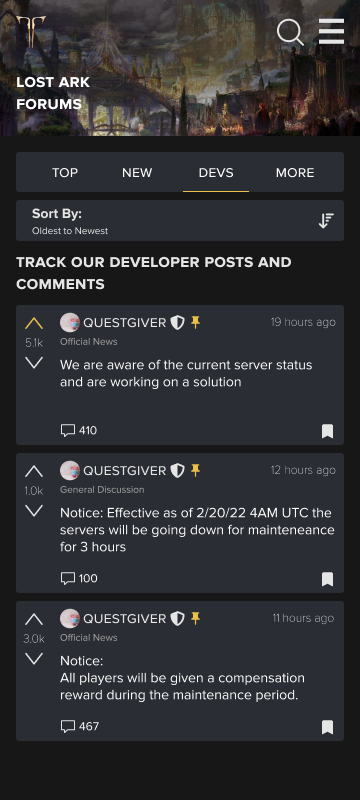
Screens



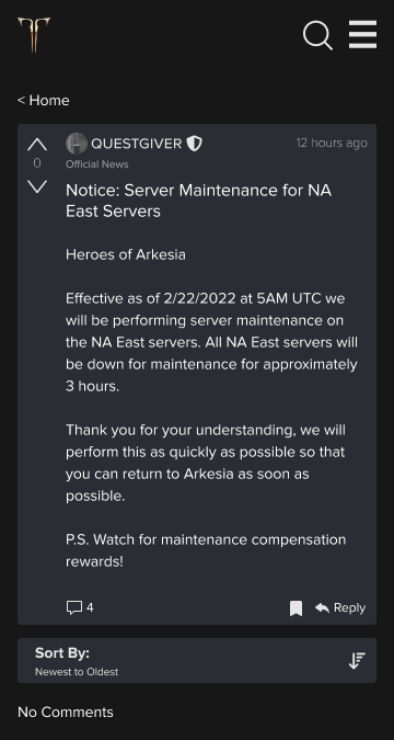
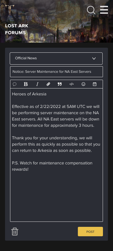
UI Kit

Testing
Prototype
At this stage I began expanding on the pages needed to create a MVP that could be used to do 3 main tasks. Browsing, Searching, and posting.
Usability Testing Findings
Navigation:
Navigation has considerably improved
Tabs for browsing has sped up the content consumption rate
Creating a new post needs more entry points
Vital information is now more visible and organized
Design:
Branding remained consistent with the live version with some small color swaps
Spacing was much better and allowed for some breathing room (Screen Real Estate)
General:
Task completion time is lower by about 10 seconds average for each task
Suggested for stronger visual feedback
Language Toggle should remain but nested in menu
Considerations:
Light mode design
Adding more personality to user profiles
Creating mega threads
Direct Messaging Capabilities
Final Remarks
What started out as a passion project turned into something tangible and readable. Well-met reception created an environment where I was motivated to improve upon the design.
Over the course of 2 weeks I had gone through about 5 different design iterations, adding components here and there, removing what wasn’t needed and refining and optimizing the experience. There was a lot to do in what was limited to an 80 hour deadline. Overall I am happy with how the product turned out. It’s not a perfect product but I was able to achieve my initial 3 goals which was to:
Improve visual hierarchy on the mobile website
Organize the information to be more readable and user friendly
Create a more memorable and optimized user experience
Something I learnt from doing this project is to never get too attached to your designs. This is a struggle that I believe all designers can relate to. It’s essentially our child that we are putting out there into the world and to see it get scrapped or changed can be disheartening. However, that is not a mindset that we should adapt but rather to know that our child hasn’t ‘been scrapped’ or ‘changed’ it has simply evolved and improved through the iterative design process.
The Future of the Lost Ark Project:
I would like to refine the current design and make sure that key features are not forgotten or unimplemented. This is to assure that if this design were to replace the old system it wouldn’t leave any users out. This initial prototype was designed with only 3 primary use cases and essentially ignored the sub use cases such as user settings, bookmarks, and other fun features that didn’t make the cut. But nevertheless are as important as any other feature.
Thank you for taking the time to read through this case study.
Feel free to look at my other works as well.


