Venmo Groups

Product: Conceptual Venmo Feature Addition
Duration: 2 Weeks
Role: UX Designer
Background
Venmo has long been one of the forerunners in mobile payment platforms between friends. With it’s ability to safely and securely send friends and family payments in a fun and convenient way Venmo has solidified it’s spot as one of the highest ranking and most used payment applications in the United States. This does not mean there are no shortcomings of the application.
Problem
Despite being a leader in what we see as a social payment platform, there are very few aspects of the application we can say is social. There is one specific use case in which using the application becomes cumbersome and takes too many interactions to accomplish. That problem is group payments. There are often times when friends will gather together and have a night out or have a nice dinner. At the end of the day someone might say “I’ll pay this time, just Venmo me later.” What this does is create one of the use case in which multiple people have to pay back one person.
Currently Venmo has very few ways of tracking on going payments and the process feels anti-human. For example in a group of 5 why should the requester need to request money 4 separate times in order to get their money back? 1 request should suffice should it not?
This is what lead me to develop the idea of Venmo Groups.
UI Highlights.



Research.
Competitive Analysis
-
Cash App
Similarities with Venmo:
- Target Audience
- Business Goal
- Between friends
- Available now to younger audiences (13-17) Requires parental permission
- Available in US and UK
- No Group functionality either
Differences:
- Focused on payments, no social aspect
- Design is hyper simplified with all key features made easily accessible
-
Paypal
Similarities with Venmo:
- Sending payments is straightforward
- Remembers recipients that are often paid/requested
- Design is functional and expanded
Differences:
- More business friendly
- Stronger customer support
- Refunds with other businesses
- Has a ‘split the bill’ feature (not a groups feature, just a request to a number of people)
Improvements compared to Venmo:
- Split the Bill post transaction
-
Up
Similarities with Venmo:
- Target Audience
- Use Cases
- Recipients are remembered
- Less business oriented
Differences:
- “Social Banking” vs social transactions
- Splitting the bill and customizing payment amounts within each split
- Can track transactions to link to splitting feature
- Offers incentives psychologically and occasionally physically for speedy payments
Improvements compared to Venmo:
- Splitting the Bill
- Incentives for quicker payments
Selection Process:
The target audience I had picked out was for the NA Audience. Primarily because Venmo is one of the most widely used platforms in America. In order to find competitors worth analyzing I needed to find competitors of either the same scale or provided a feature/service that was worth implementing.
First and foremost Cash App is an application that achieves the same goals as Venmo albeit a much more simplified process. They emphasize simplicity and speed of transaction over all else. Thus the name of the application. What they do nicely is advertise to all age groups through both design and the lifting of physical limitations such as age limits.
Secondly is the parent company of Venmo which is Paypal. This platform has been around for a long time and has been accepted as a form of online payment for several years as well. Selecting the parent company to learn from was a no-brainer.
Lastly a wildcard choice was ‘Up’ a social banking application used in the Australian market. While not in the NA market it provided features that were much more convenient than the current capabilities that Venmo offered. Features such as bill splitting, incentives, and transaction tracking. What this meant for the user was enabling them to be in control of their transaction from beginning to end.
Personas
-

The Highschool / College Student
- Uses Venmo to pay friends for meals/activities
- Pays for club dues
- The highest percentage demographic of users
- Uses Venmo essentially on a daily basis
-

Millennials / Working Force
- Used between colleagues to split meal bills
- Second largest demographic
- Uses Venmo on the occasional night out with friends/colleagues after work
-

Parents / Guardians
- Used to send money wirelessly to their kids or family members
- Not used often/could be replaced with a different platform
- Smallest demographic
Brand/Design System Analysis:
Brand Identity:
Concept: Quick, safe, and social payments between friends.
Values: Friendships are enhanced through the payments rather than complicated, creating memories/joy rather than being seen as a method of collection.
Mission/Vision: aims to connects businesses to people as friends and to improve their platform through the drive of the community
Customer Experience: creating small snippets into the lives of both the recipient and sender through the payment messages. Creates a ‘fun’ aspect to it
Visual Branding:
Typography:
Primary: Helvetica Neue
i. All platforms should use this, if not supported fall back to either
1. Helvetica
2. Arial
Secondary: Georgia
i. Used primarily for document legibility
Venmo Blue
Very Light Grey
Light Grey
Grey
Dark Grey
Color Palette
Define & Design.
Task Flows
I based my earliest concepts on these two primary task flows which encapsulated the main idea / use cases of this feature.
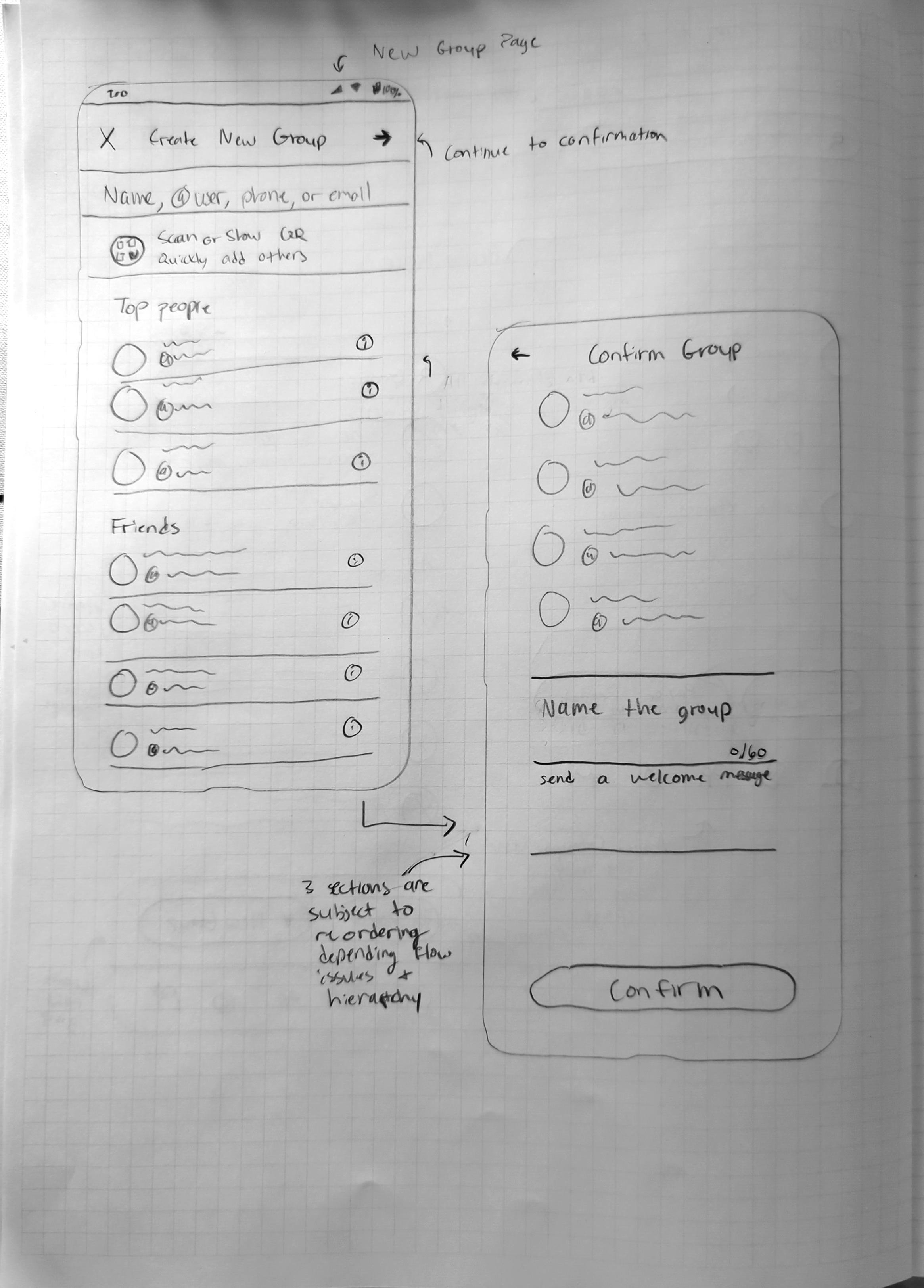
Sketches

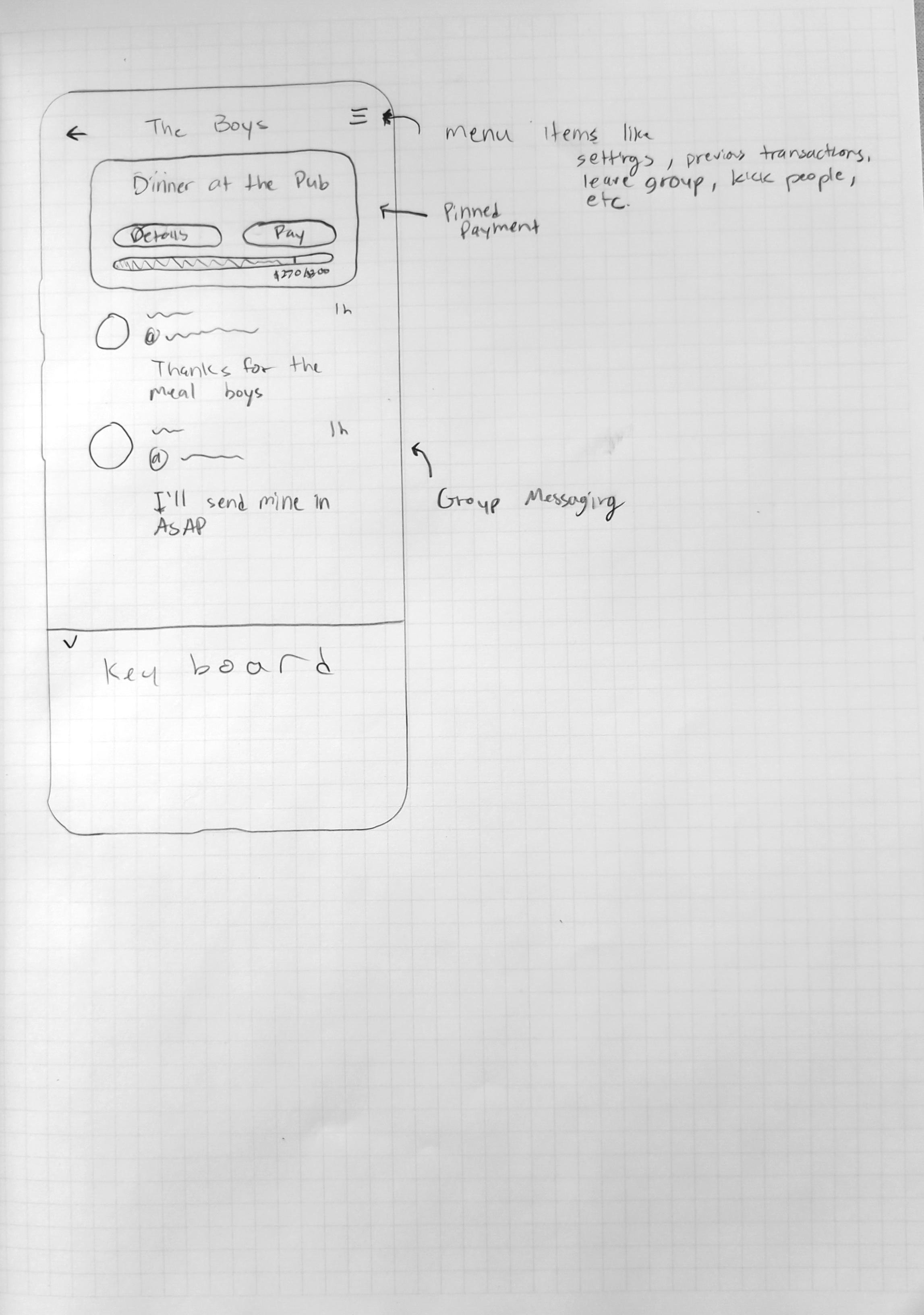
Early Lo-Fi Screens
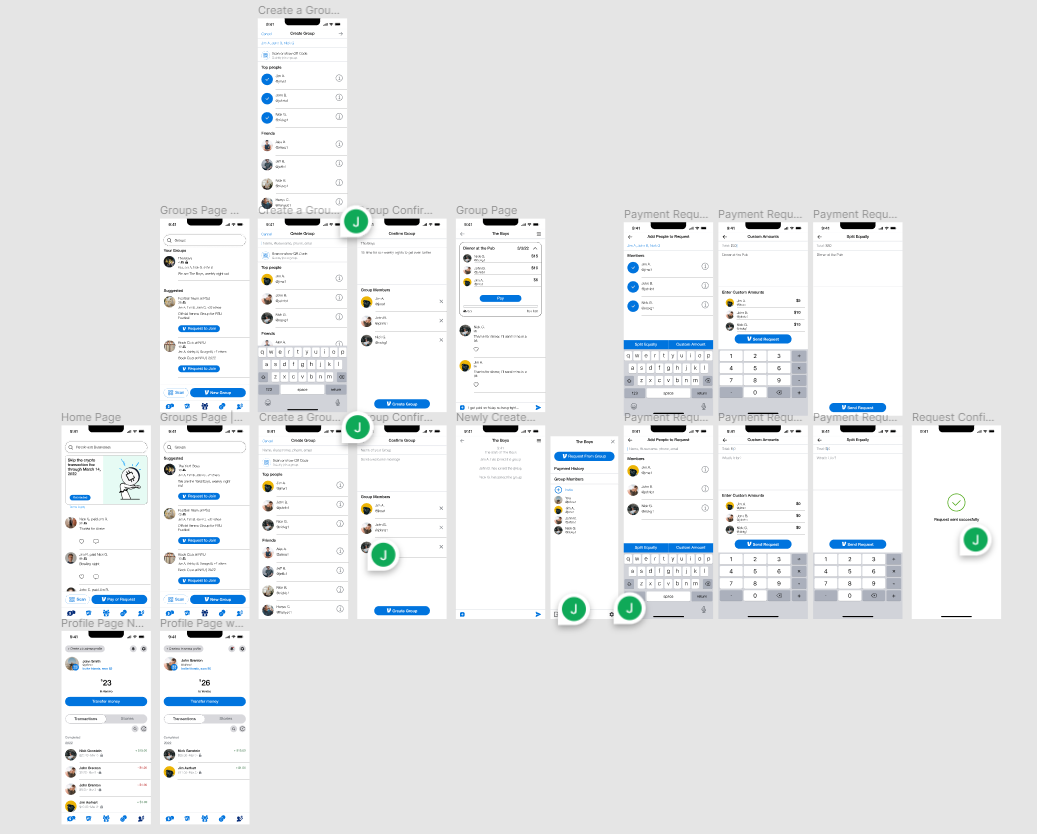
I began with designing the critical point screens within the flow. Starting from the home page and then ending with a page with a pending payment. I used a lot of tools and tricks in order to emulate the design style of Venmo to the greatest degree. As I had no tools or access to more specific design guidelines, a bulk of the early stage was spent searching for assets.
In this iteration I had added in some in-betweens and contextual items to help flesh out the feeling of the application. This included imagery, iconography, and reworking the flow in places it wasn’t working out in.
At this point I began incorporating small feedback sessions between each major iteration in order to gather important data and points of improvement.
User participants had asked me 3 critical questions that led to large improvements in my design.
1. How do the group chats function with multiple pending payments?
2. Why did you make separate screens for equally split payments and custom payments
3. What about problematic situations like trolls, spamming, etc?
This made me reconsider aspects of my design to make sure ethical design was being taken into consideration. In addition to ethics, I shortened each flow respective flow by condensing options onto one page.
Testing & The Future.
The Prototype.
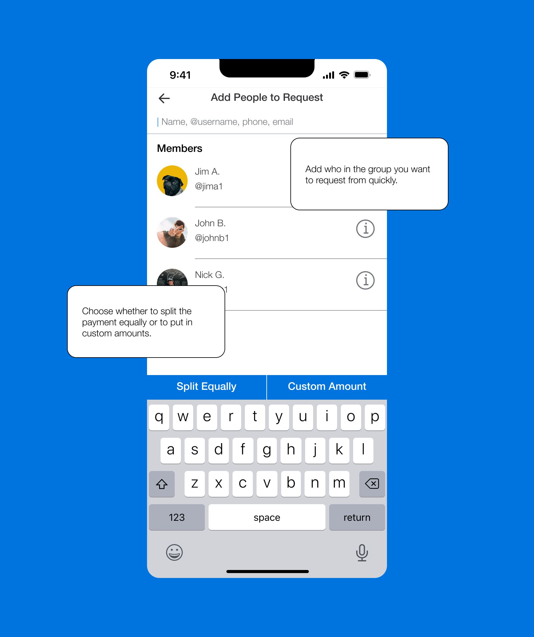
Encapsulated into 3 primary use cases, this prototype starts from the home page of Venmo and ends with a successful request to your group of friends.
1. Create a new Venmo group
2. Send out an equally split request
3. Send out a custom amount request
Extra Considerations
-
Group Settings
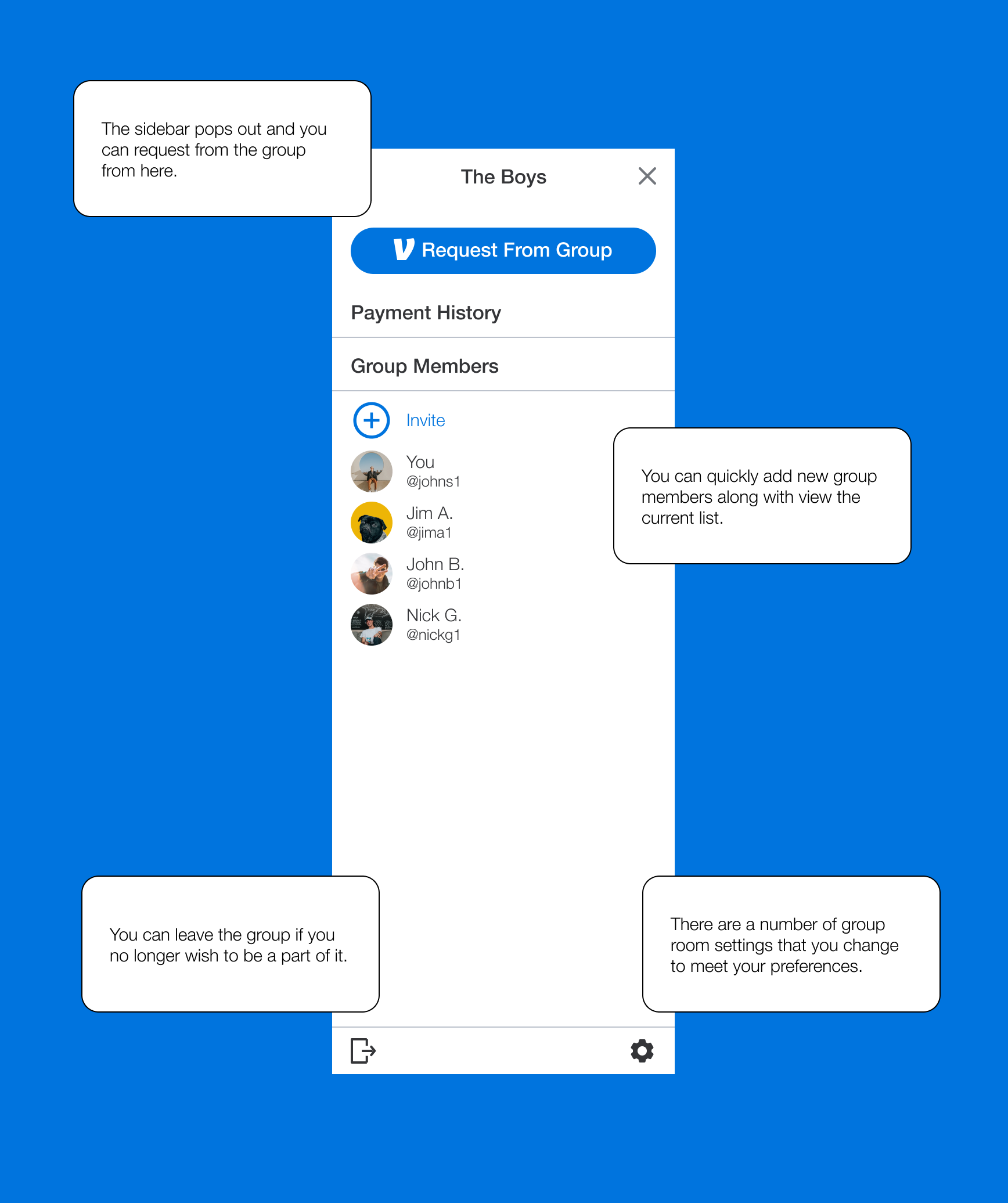
I created this feature with the intention to make it more social but with social aspects, come social problems. In order to combat this or at least provide the tools to our users I added a number of controls that would allow for both privacy and safety.

-
Notifications Page
A feature that is seldom used on the live application should now be a home for users to view group invitations, group payment requests, and other important notifications.

-
Collapsible Group Request Pin
While having pinned notification at the top of a group chat is quick and convenient way of making sure no information is lost, it becomes problematic with this current design. The collapsible component allows for screen real estate. A more permanent solution is to have previous transactions act as a chat item and scroll by as you go through the chat history. All payments can still be found through the payment history menu item.

Key Takeaways
Improvements to be made:
Some ideas require more in depth explicit interactions in order to convey the interaction in a clear manner
Further developing the group controls and permissions would help a user feel more inclined to use the feature.
Adding a search flow for groups as well could provide beneficial insight into what a user might do in order to find the group they wish to join.
Design:
The overall design remained in-line with the current live application to furthest degree.
Most users mentioned that the design itself already feels integrated into the app even though it’s only a prototype
The information organization and task flow was very human and lead to very few mistakes in navigation
Future Considerations:
Adding more flexibility in the flows
Ability to set more group preferences at the time of creation rather than post creation
Blocking and blacklist feature should be fleshed out
Final Remarks | A Letter to You
This project, while early in its development life, was fueled by one feeling. Annoyance. I believe when an app can bring about a feeling of annoyance there is a business idea, or an improvement, or an innovation waiting to be made.
This is how I began researching and designing this feature for Venmo. It was a personal vendetta. I genuinely hope in the future I can work to create something similar to this feature and watch it come to life.
Somethings that I’ve learnt while designing this feature were:
1. Ethical design should not be overlooked especially on applications with human to human interactions.
2. It is naïve to believe that your application can only be used for good.
3. Designing with a pre-established design guideline speeds up design iterations two fold.
4. Getting feedback and testing done earlier will massively improve your project down the road at the later stages of development.
Thank you for taking the time to look through this case study. If you’d like please take a look at my other projects as well.
Best,
Jeffrey Oh


