Product: End to End Mobile Application
Duration: 2 Weeks
Role: Product Design/UX Design
Background
Terra is a mobile application created with users time in consideration. It maximizes on simplicity and an elegant design with a streamlined caretaking process in order to assist in taking care of your home plants & gardens.
Problem:
I created this application with the intention of simplifying the logging process and care taking aspect of home gardening. Everybody nowadays has a lot on their minds and it becomes easy to forget to take care of our plants. This drove me to create an application that would solve this problem in a simple and elegant way.
Goals:
Improve daily diligence of home gardeners
Create a simple solution for the widest range of gardening proficiency
Make something enjoyable
UI Highlights

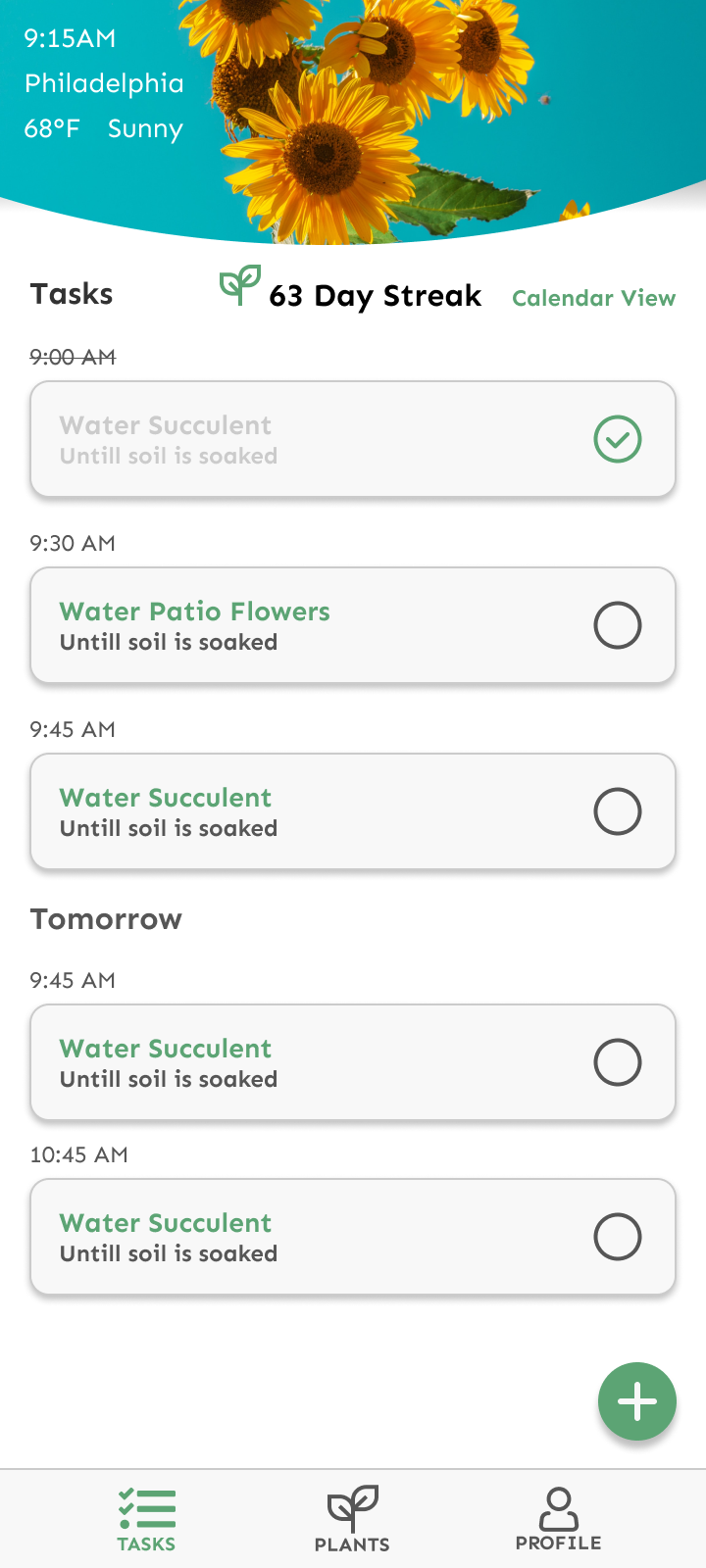
The home screen is a timeline of tasks both for the current day and upcoming tasks as well. A simple checklist and straightforward way to add a new task using the green add button.

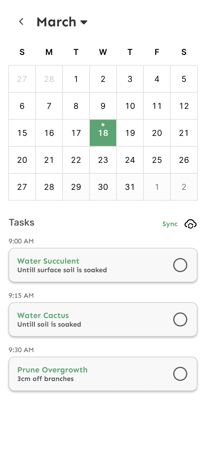
The calendar view to quickly view tasks for any given day. A sync option is built in so that we can send these events to a different calendar application.
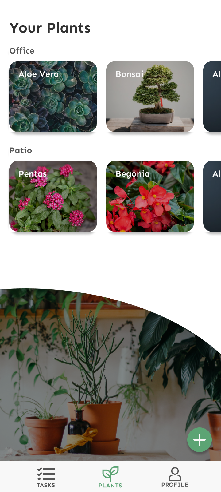
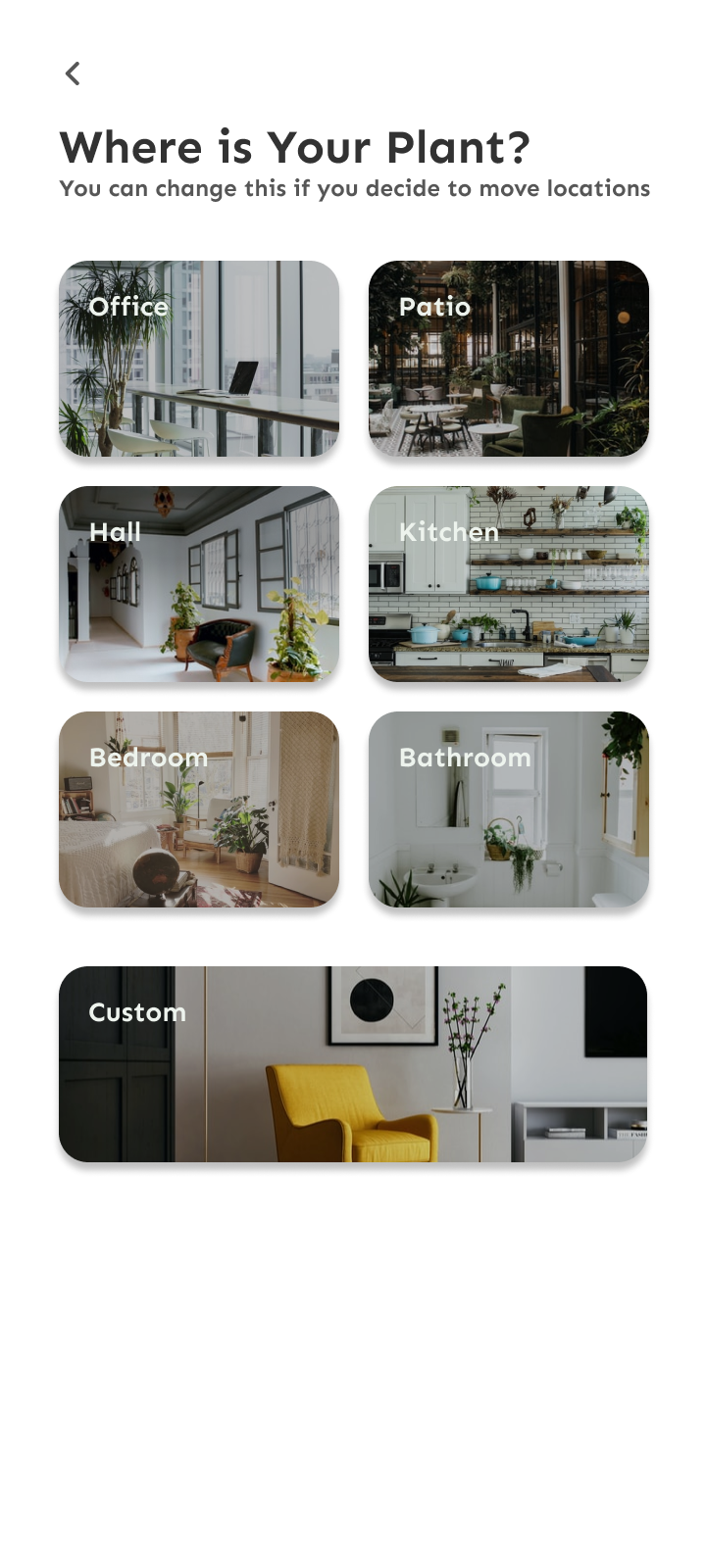
A quick view of all of our plants organized by location. Adding a plant is as simple as pressing the add button and following that flow.

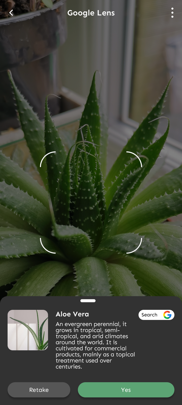
A google lens integration to allow for users to scan their plants in the case that they do not know what their plant is. This feature is also implemented in the auto register feature.
Research
Competitive Analysis, Personas, and Card Sort
Competitive Analysis
-
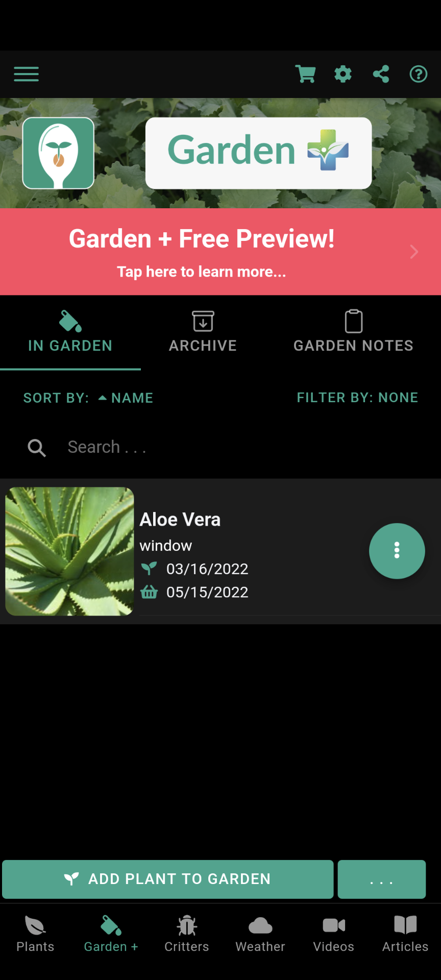
From Seed to Spoon
Helpful Features:
Planting Dates are listed and projected harvest date as well
Can specify location (Not in a visually clear way but still allows for it)
Can Archive plants that have been removed or have died
Adding notes per location along with notes per plant
Health Benefits of plants are listed as well
Conditions
Growing Season
Frost Tolerance
Sprout to harvest time frame
Sun Requirements
Water Requirements
Fertilizing Recommendations
Takeaways:
Visual Consistency to improve UX
Less is more
-
Planter - Garden Planter
Helpful Features:
Virtual gardens for square foot gardening
Task Schedule in timeline visual format
Guides for gardening
Can add own images
Takeaways:
Lean away from information overload
When registering a plant a user should not be overwhelmed
-
Planta
Helpful Features:
Simple and Clean UI
Organize plants by site
View by site or view by plant
Registering a new plant is straightforward and multi-step/page
Home page is a task page
Weather is displayed at the top
Takeaways:
Don’t show premium features at all if they require premium
Essential features should not be premium features
Do not over advertise
Selection Process
When I was looking for competitors on the current marketplace I always looked at the highest performers in terms of highest active userbase with the best ratings. These 3 stuck out to me not only because of the criteria i mentioned prior but also because of the creative utilities provided to the users. For example Planter had done something that I’ve never seen before in gardening which was creating this virtual garden to manage which was their main use case/selling point. Although I didn’t use this feature I could still learn from their design patterns and processes.
A great amount of inspiration was gathered from Planta as they had one of the most elegant designs. One thing that I couldn’t get behind was that Planta was what we would call a freemium application in which many of the convenient selling points were locked behind a paywall. It ruined the experience and create a divide in users.
Seed to Spoon, while not the cleanest looking application, covered all of their bases when it came to how to take care of your plant. Everything you could think of, temperature, watering methodology, bugs/pests, tutorials, etc. You name it, they had it.
Personas
-

Beginner
Can keep low maintenance plants alive for the most part. Does not stick to a schedule and believes that watering cycles are the same for all plants. Does not track plant progress at all.
-

Intermediate
Understands water cycles, light levels, and keeps a number of plants alive but needs a way to organize tasks. Occasionally takes photographs for progress.
-

Advanced
Understands the ins and outs of gardening to the utmost useful maximum. Most likely does not need tips but would like a way to track the growth progress of their plants virtually. Journals / keeps progress manually or through other apps
Card Sort
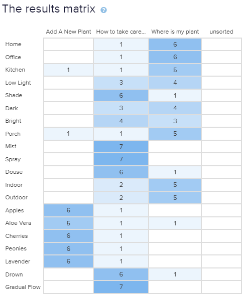
Performed a card sort on 7 user participants. They were simply asked to categorize each card into 3 respective categories. The general trend went as followed but the primary takeaway was that words related to light and place were put into the same category and words related to treatment and light found its way into multiple categories.
Using this information I made sure to make my location and light based pages on separate pages in order to make there was less confusion surround the topics.
Define.
Create the foundations of my application through maps and sketches
Site Map
User Flows
Primary Use Cases
Black: Pages
Yellow: Actions
My thought process:
I knew that trying to cover a larger breadth of use cases would cause this application to feel worse overall so I took a few use cases and tried to go in depth and work through them carefully. My objective with these task flows was to make sure that I had a general reference so that I don’t accidentally go astray in my design process. By creating succinct flows that accomplish the use cases It enabled me to design through the designs much quicker and there was no point where I was wondering what’s next. (At least this was the case in the early stages)
Modified Task Scheduling Flow
I created this new flow to accommodate for the experience levels. In the previous iteration it was not comprehensive enough to cover all of my user base.
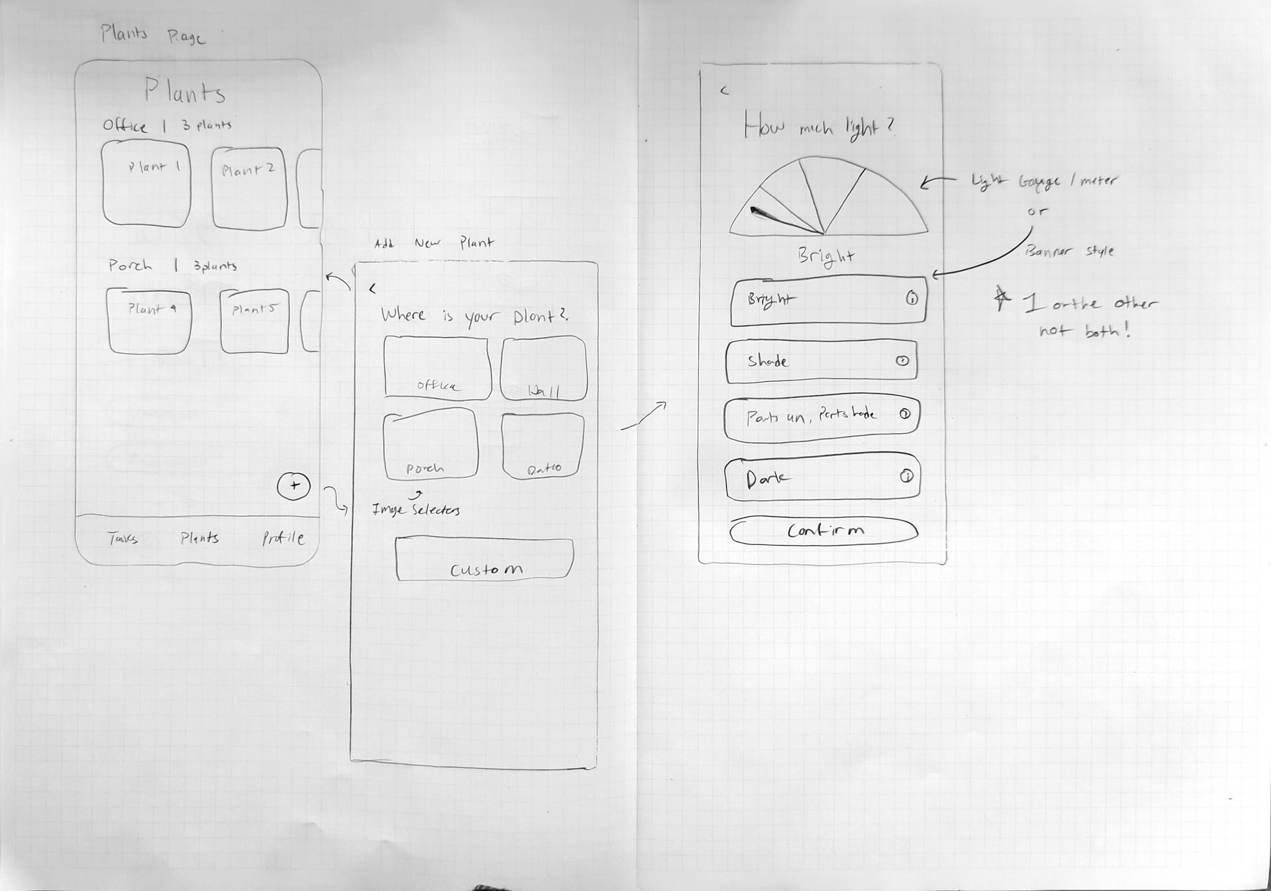
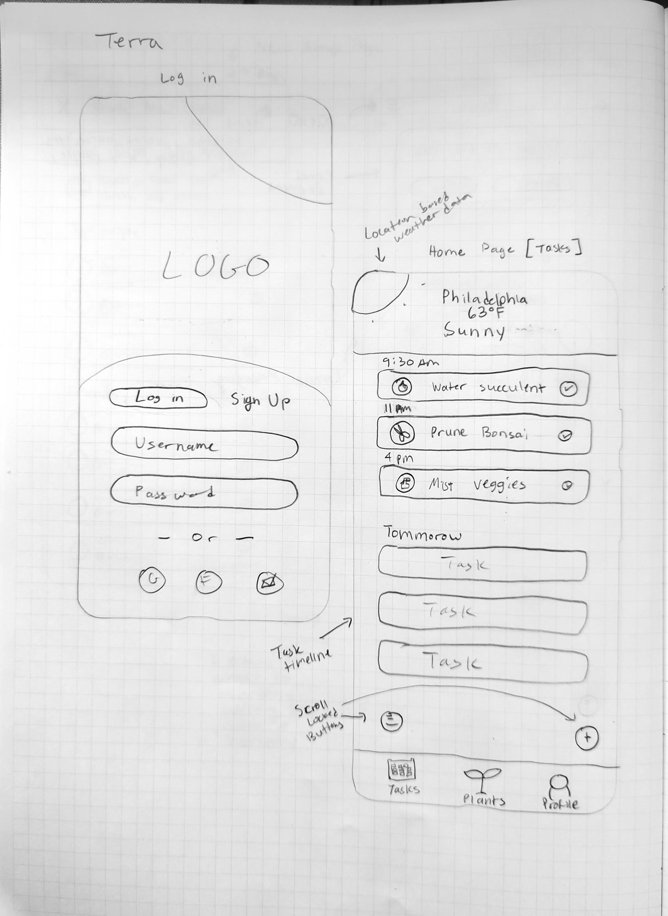
Sketches
Thoughts during sketching:
In early ideation I was already pretty close to my current designs. However there was a design that I attempted with the light gauge. Unfortunately It didn’t work out and it felt too gimmicky. On top of the gimmicky feeling of the gauge it just didn’t fit the design aesthetic I was going for. Meaning it destroyed the sense of coherency and consistency within the application.
Button placement and larger containers has overall changed but the sizing and functionality has remained the same. Looking at my login page and homepage I remember how many different internal monologues I had with myself, arguing about placement, current design standards/trends, and what the optimal combination was. Ultimately I couldn’t decide that so early on so I gave up and picked what felt simple and elegant, from there all that was left was testing and iterating to further refine it.
Screens



Homepage Comments:
This is the page that I spent the most amount of time and tears over. In the earliest iterations of my design I just couldn’t figure out how to get the weather banner to look just the way I wanted without compromising on functionality and visual consistency. I ended up using this masked circular banner so as to alleviate the stressful and boxed in feeling of square containers.
With regards to the task timeline, I spent some time deliberating on certain design choices. Originally the task completion bubbles were more like checkboxes. I wanted this app to feel more free and lighthearted while remaining simplistic and elegant. In order to do this I softened as many different aspects and elements of the design as I could feasibly do. We also grayed out the text on a task once it was marked as completed so as to push forwards this thought that “Hey I just finished this task it’s time to move on”.
I hope when people look at this screen they think that It looks elegant as well.
Task Details Page Comments:
I despised designing this page due to the sheer number of consideration I had to take while creating it. So much research and so many different iterations just to create something that looks like an alarm setup.
This page was definitely my biggest regret and is a page that I would like to improve on in the future. You might be asking what’s so bad about it?
While I did give myself a little pat on the back for the Auto Task Setup feature the rest of the fields and options are lacking substantially in flexibility and customizability.
Some quick band-aid fixes I would apply would be to add a separate ‘notes’ field for extra information, A dynamic calendar instead of this alarm type setup, and perhaps some more information provided to the user.
Testing
Prototype, User Interview, Key Findings Report, and Final Remarks
Prototype
This includes duplicates of pages in various states. Interactions, site mapping/connections were made along with other stylistic changes.
Interview Findings
Needs
More information on the plant on the plant details screen
Tips and tricks for each plant (Optional setting)
A more refined task creation flow/screen
Wants
A way to name prefab locations during the plant registration flow
Calendar sync clarity (What does the feature do?)
A preview of the notification/push message
Likes/Dislikes
Dislikes:
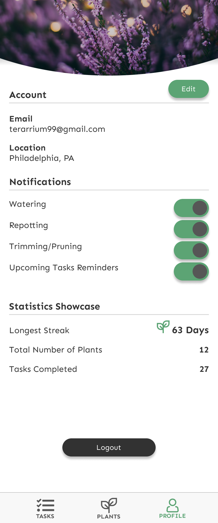
Daily Streak design inconsistency
Calendar could be cumbersome
Likes:
Plant Registration flow is smooth and simple
Google Lens integration was a good idea (AI Camera recognition)
Insights
The depth of gardening is much deeper than it may seem and it also may require a deeper functionality when it comes to note taking for plants
Understanding values are what drives functionality and new features will help me to become a better designer
Finding the balance in hiding features vs showing them outright is tricky and needs more testing
Final Remarks: A letter to you
This case study had me stumped for a while. It was my biggest creative block as I was doing something that was way out of my comfort zone. It was a topic I wasn’t knowledgeable on and with such a limited time frame I had to make do.
Over the course of the 2 weeks I would say about 40% of the time was spent deliberating on what should and shouldn’t be in the design. I wanted to make a simple and refined experience for a problem that was in no shape or form simple or refined. Of course this made the task much more challenging than I had originally thought.
One of the main lessons I learnt as a designer working on this project was that you should never expect or assume anything when it comes to time-blocks, schedules, and deadlines. After speaking with colleagues/mentors I learnt that this is completely normal and an everyday occurrence. People will run into blockers whether they be creative or physical ones, it doesn’t matter. The schedule is no law nor is it something to overstress about. We take our losses and learn from them so that we as designers can improve at what we do best. Designing.
The future of this project:
If I’m to be completely honest, I would say in terms of visual work this project doesn’t need to go anywhere else. I would most likely spend some time fleshing out micro interactions and making sure visual feedback is strong enough to make sure the user has a good user experience.
If you made it to the end of this case study I want to personally thank you for taking the time to do so! If you’re interested in working with me you can reach me here.
Feel free to look at my other works too. I’d appreciate any feedback that you have to offer.
Jeffrey Oh

